
Hollywood films are recognised for their distinctive visual style, carefully controlled colour palettes and consistent imagery. From the warm, golden tones of a period drama to the cool, atmospheric shadows of a science-fiction thriller, colour grading plays a major role in shaping how an audience experiences a film.
Whether you are working on a feature film, music video, documentary, short film or YouTube production, the principles behind professional colour grading can be applied to your own footage. DaVinci Resolve provides a comprehensive set of tools for colour correction, creative grading, shot matching and colour management, making it possible to develop sophisticated cinematic looks on a desktop computer.
What makes Hollywood colour grading look professional?
The term Hollywood colour grading refers to a broad range of professional techniques rather than one particular visual style. A film's final appearance is influenced by its cinematography, lighting, production design, camera technology and the creative decisions made during post-production. Colour grading brings these elements together to create a consistent visual language.
A successful cinematic grade usually begins with technically accurate footage and then introduces a creative direction that supports the story. Exposure, contrast, saturation and colour balance are carefully controlled, while selective adjustments can be used to draw attention to important details or create a particular atmosphere.

For example, a thriller might use restrained saturation and cool shadows to create a sense of tension, while a romantic drama might use warmer highlights and softer contrast. A science-fiction film may rely on a carefully limited palette of blues, greens and neutral tones, whereas a historical drama could use muted earth colours to create a sense of period authenticity.
The most important lesson is that professional colour grading is about making deliberate decisions. A cinematic look should suit the footage, the story and the intended audience.
1. Establish a visual concept before grading
Before adjusting the colour wheels or applying a LUT, decide what you want the finished footage to communicate. This is one of the most valuable habits you can develop as a colourist, because it prevents you from making random adjustments simply because they look interesting.
Consider the mood of the scene, the time of day, the location and the emotional state of the characters. If you are grading a music video, think about how the colour palette can complement the music and visual identity of the artist. If you are grading a documentary, consider whether the footage should feel naturalistic, atmospheric or deliberately stylised.
Create a reference board
Collect stills from films, photographs or other visual references that match the look you want to achieve. You do not need to copy the exact colours from a reference image; instead, examine the characteristics that make it appealing. Look at the contrast, shadow detail, skin tones, saturation and the relationship between warm and cool colours.
For example, if you want to create a moody cinematic look, compare several films that achieve this through different techniques. One may use deep shadows and cool highlights, while another may use warm lighting with muted colours. This will help you identify the specific qualities you want to reproduce.
Professional colourists often work closely with directors and cinematographers to establish a visual direction before the final grade. A useful reference board can help you communicate your intentions and maintain consistency throughout the project.
2. Correct exposure and white balance first
Colour correction is the technical foundation of a professional grade. Before applying creative effects, make sure your footage has a suitable exposure, white balance and contrast balance. This will give you a more reliable starting point and make it easier to achieve consistent results across different shots.
In DaVinci Resolve, the Colour page provides primary correction tools for adjusting brightness and colour. The Lift, Gamma and Gain controls affect different tonal ranges, while Offset can be used for broader changes to the overall image. Resolve also includes primary bars, log controls and additional adjustment tools for more precise corrections.
Use the Waveform and RGB Parade
The Waveform scope is useful for judging the brightness of your footage. It allows you to see whether the shadows are too dark, the highlights are clipping or the overall image needs to be balanced. The RGB Parade shows the red, green and blue channels separately, making it easier to identify unwanted colour casts.
A common mistake is to judge exposure and colour entirely by eye. Your monitor, room lighting and personal preferences can influence how you perceive the image. Scopes provide an additional reference that helps you make more consistent decisions.
You do not need to force every shot to have the same brightness range. A night scene should remain dark, and a bright exterior should retain its natural brightness. The goal is to preserve important detail and create an image that looks intentional.

3. Understand colour management and log footage
Many modern cameras record footage using log gamma curves and wide-gamut colour spaces. These formats preserve more information for post-production, but they can look flat and desaturated when viewed without the appropriate colour transform.
DaVinci Resolve's colour management system allows you to define the input colour space, working colour space and output colour space for your project. Resolve also supports ACES workflows, giving colourists additional options for managing footage from different cameras and preparing projects for delivery.
If you are working with DJI D-Log, DJI D-Log M, Canon C-Log or Insta360 I-Log footage, identify the exact profile used by the camera before applying a technical LUT or creative grade. A LUT designed for one profile may produce inaccurate results when applied to another.
DaVinci Wide Gamut and Intermediate
DaVinci Wide Gamut and DaVinci Intermediate provide a broad working space for colour correction and creative grading. This can be useful when combining footage from different cameras or when you want to retain flexibility throughout the grading process.
A typical workflow is to transform the footage into a suitable working space, make your primary corrections, create the creative look and then transform the image into the final output colour space. The exact workflow depends on the project settings and the type of footage you are using.

4. Build a cinematic contrast curve
Contrast is one of the most important elements of a cinematic image. A carefully shaped contrast curve can give footage depth and separation while retaining detail in the shadows and highlights.
DaVinci Resolve's Custom Curves tool allows you to adjust the relationship between input and output brightness. A gentle S-curve can deepen the shadows and increase highlight separation, creating a more polished appearance. You can also use the HDR colour wheels to control different tonal ranges with greater precision.
How to create an S-curve
Start by opening the Custom Curves panel on the Colour page. Add a point in the lower portion of the curve and move it slightly downwards to deepen the shadows. Add another point in the upper portion and move it slightly upwards to lift the highlights.
The adjustment should be subtle. If you push the curve too far, you may crush important shadow detail or clip highlights. A professional grade often relies on small changes that work together rather than a single dramatic adjustment.
The midtones are particularly important because they contain much of the visual information in a typical shot. Avoid making the entire image too dark or too bright, and check the result on the Waveform scope as you work.

5. Use colour theory to create a cinematic palette
Colour theory is central to professional colour grading. Many films use a limited palette to create visual consistency and establish a particular emotional tone. Complementary colours, analogous colours and carefully controlled saturation can all be used to create a cohesive image.
A common example is the use of warm skin tones against cooler backgrounds. This creates separation between the subject and the environment, helping the viewer focus on the character. However, the same principle can be applied with other colour combinations, depending on the scene.

Experiment with complementary colours
The teal-and-orange look is one of the most recognisable cinematic grading styles. It can work well because warm skin tones contrast with cool blue-green backgrounds, creating a clear separation between the subject and the environment.
In DaVinci Resolve, you can create a subtle version of this look by cooling the shadows slightly and warming the highlights. Use the colour wheels or Log controls to make these adjustments, then review the image to ensure that the skin tones remain natural.
You can also use the Hue Vs Hue and Hue Vs Sat curves to refine individual colours. For example, you might shift an overly cyan sky towards blue or reduce the saturation of distracting green foliage. These selective adjustments can help you create a more controlled palette without affecting the entire image.
6. Protect skin tones
Skin tones are one of the most important elements in a professional grade. The audience is highly sensitive to unnatural skin colour, and even a small shift can make a character look ill, overly warm or disconnected from the environment.
The Vectorscope provides a useful reference for monitoring skin tones, while the Qualifier tool can isolate a particular range of colours for selective adjustments. DaVinci Resolve also includes tools for refining masks and applying localised corrections.
When grading skin, avoid making every face look identical. Natural skin contains a range of tones, and the lighting in a scene may create warm or cool variations. The objective is to maintain a believable appearance while keeping the grade consistent.
Use Hue Vs Hue for subtle corrections
If skin appears too magenta, you can make a small adjustment towards a more neutral hue. If it looks too yellow, you can shift it slightly in the opposite direction. The Hue Vs Hue curve is useful for these corrections because it allows you to target a specific colour range rather than changing the entire image.
After making the adjustment, check the result against the original footage and review the skin tone on the Vectorscope. A small correction is often enough to make a noticeable difference.

7. Use Power Windows to direct attention
Power Windows are among the most useful tools in DaVinci Resolve for creating cinematic images. They allow you to apply colour and exposure adjustments to specific areas of the frame, making it possible to direct the viewer's attention towards a subject or important detail.
For example, you might create a subtle circular Power Window around a character's face, slightly lift the exposure and reduce the brightness of the surrounding area. This can help the subject stand out without looking like an obvious spotlight.
You can also use Power Windows to darken a bright sky, add a gentle vignette or create a gradient across the frame. The effect should be subtle enough that the audience notices the subject rather than the correction itself.
Create a natural vignette
To create a vignette, draw a circular Power Window around the area you want to emphasise. Invert the window, increase the feathering and lower the exposure slightly outside the selected area. The result should be a gentle darkening around the edges of the frame.
A vignette can be particularly useful in close-ups or scenes where the background contains distracting elements. However, avoid making it too strong, as this can make the image appear artificial.
8. Track moving subjects
Power Windows become even more useful when they can follow a moving subject. DaVinci Resolve includes tracking tools that allow you to analyse movement and keep a window attached to a face, car or other object.
A typical workflow involves creating a Power Window around the subject, opening the Tracker panel and analysing the clip. Once the tracking data has been generated, review the result throughout the shot. If the window drifts or loses the subject, adjust the track or add keyframes to correct it.
Tracking can save a considerable amount of time when working on complex scenes. It also allows you to make more precise adjustments without manually changing the mask on every frame.
9. Match every shot in the scene
Shot matching is one of the most important skills in professional colour grading. A sequence can contain footage recorded at different times, under different lighting conditions or with different camera settings. Even if each individual shot looks good, the scene can feel inconsistent when the shots are placed together.
Start by choosing a reference shot that represents the desired look for the scene. Then compare the other shots against it, checking exposure, contrast, white balance and saturation. Use the scopes and split-screen comparison tools to help identify differences.
Use the Gallery and stills
DaVinci Resolve's Gallery allows you to capture stills from graded shots and compare them against other clips. This is particularly useful when working through a long sequence, as it provides a visual reference for the grade.
A good approach is to create a still for each important scene or lighting condition. You can then use those stills to compare shots and maintain consistency throughout the project. If a scene changes from daylight to evening, for example, the stills can help you maintain a coherent transition in the colour and exposure.
10. Build a structured node tree
DaVinci Resolve's node-based grading system is one of its greatest strengths. Instead of applying every adjustment to a single clip, you can divide the grade into separate stages, making it easier to understand, refine and reuse.
A typical node tree might include a technical correction node, a primary balance node, a contrast node, a creative look node and a final refinement node. You can also use parallel or layer nodes for selective corrections, such as skin tones or background adjustments.

A practical node workflow
Start with a technical correction node that handles the input transform or log conversion. Follow this with a primary correction node for exposure and white balance, then a contrast node for shaping the tonal range.
Next, create a creative look node where you can apply a LUT or develop the colour palette by hand. Additional nodes can be used for skin tone corrections, Power Windows and other selective adjustments.
The advantage of this structure is that you can make changes without losing control of the grade. If you decide to reduce the intensity of the creative look, you can adjust the relevant node rather than rebuilding the entire grade.
11. LUTs: Are they useful for cinematic colour grading?
LUTs, or Look-Up Tables, are widely used in professional colour grading. They are mathematical transforms that map input colour and brightness values to new output values. In practical terms, a LUT can change the appearance of footage by applying a technical conversion or a creative look.
There are two main types of LUT that you will encounter as a filmmaker. Technical LUTs are designed to convert footage from one colour space or gamma curve to another, while creative LUTs are intended to introduce a particular visual style. Film-emulation LUTs are another popular category, designed to reproduce some of the colour and tonal characteristics associated with film stocks.
DaVinci Resolve supports LUTs as part of its colour grading workflow, and the software's official Colorist Guide includes exercises on importing, applying and creating LUTs.
When LUTs are useful
LUTs can be an excellent starting point for filmmakers who want to establish a cinematic look quickly. They are particularly useful when working with compatible camera profiles, such as DJI D-Log, DJI D-Log M, Canon C-Log or Insta360 I-Log.
A well-designed LUT can provide a consistent baseline across a project, allowing you to experiment with different looks without building every adjustment from scratch. This can be helpful when grading a large number of clips or when you need to maintain a particular style across several scenes.
LUTs are also useful for monitoring during production. A cinematographer may use a show LUT to preview how log footage could look after grading, helping the production team make creative decisions while shooting. A monitoring LUT is not necessarily the same as the creative LUT you use for the final grade.

When manual grading is better
Manual grading gives you greater control over the image and allows you to respond to the specific characteristics of each shot. This is particularly useful when footage contains unusual lighting, inconsistent exposure or complex colour relationships that a preset cannot account for.
For example, a LUT may produce a pleasing result on a well-exposed exterior shot but create overly dark shadows on an underexposed interior. By grading manually, you can adjust the exposure, contrast and colour balance to suit the scene rather than accepting the same transformation across every clip.
Manual grading is also valuable when you want to create a unique look that does not resemble a particular preset. You can build the grade from the primary colour wheels, curves, HDR controls and selective adjustments, allowing the creative direction to develop naturally.
The best approach: Combine LUTs with manual grading
For many filmmakers, the most efficient workflow is to use a LUT as a starting point and then refine the image by hand. This gives you a quick way to establish the look while retaining control over the final result.
In DaVinci Resolve, you can apply a LUT to a dedicated node and use additional nodes to adjust exposure, contrast, saturation and selective colours. If the LUT is too strong, you can reduce the node's Key Output Gain to blend the effect with the original image, or use further corrections to adapt the look to the footage.
A LUT should never be treated as a substitute for colour correction. If the footage is incorrectly exposed or has an unsuitable input transform, applying a creative LUT may exaggerate those problems. Always check the technical compatibility of the LUT and establish a suitable starting image first.
12. Editors Keys colour grading LUT packs
Editors Keys colour grading LUT packs provide a convenient way to experiment with cinematic looks in DaVinci Resolve and other compatible grading programmes. The packs are designed for different camera shooting profiles, allowing you to apply presets to compatible footage and then refine the result using your own grading techniques.
The range includes LUT packs for DJI D-LOG, DJI D-LOG M, Canon C-LOG and Insta360 I-LOG. These are useful starting points for filmmakers working with drone footage, mirrorless cameras, action cameras and other compatible devices.
DJI D-LOG LUT Pack
The Editors Keys DJI D-LOG LUT Pack is designed for compatible DJI D-LOG footage. It can provide a creative baseline for aerial footage, landscapes, travel videos and cinematic drone shots.
DJI D-LOG footage often requires a suitable technical conversion before a creative LUT is applied. Check the exact camera profile and product instructions to ensure the LUT is appropriate for your footage.
DJI D-LOG M LUT Pack
The DJI D-LOG M LUT Pack is intended for compatible DJI D-LOG M footage. It can help establish a cinematic colour palette for footage recorded on supported DJI cameras and provide a starting point for further creative adjustments.
D-LOG M and D-LOG are different shooting profiles, so it is important to use the correct LUT for the footage you have recorded.

Insta360 I-LOG LUT Pack
The Editors Keys Insta360 I-LOG LUT Pack is designed for compatible Insta360 I-LOG footage. It can provide a starting point for grading action camera and 360-degree footage, helping you experiment with cinematic colour palettes and contrast.
As with any LUT, make sure the footage is compatible with the intended shooting profile and that the correct technical conversion is used before applying the creative look.
Canon C-LOG LUT Pack
The Editors Keys Canon C-LOG LUT Pack is designed for compatible Canon C-LOG footage. It can be useful for filmmakers who want to create cinematic looks from Canon camera footage without having to build every preset from scratch.
Once applied, you can refine the grade using DaVinci Resolve's primary colour wheels, curves and selective corrections. The LUT provides a starting point, while the final result remains under your control.

13. Use film grain and texture carefully
Film grain is another technique that can help create a more cinematic appearance. Digital footage can sometimes look very clean and clinical, particularly when recorded at low ISO settings or with modern high-resolution cameras. Adding a subtle amount of grain can introduce texture and help the image feel more organic.
DaVinci Resolve includes a Film Grain effect in the OpenFX panel, allowing you to add a controlled grain structure to your footage. The amount and size of the grain should depend on the footage and the intended look. A fine grain can work well for a naturalistic drama, while a heavier grain might suit a stylised music video or period piece.
However, grain should be used with restraint. Excessive grain can obscure detail, introduce distracting noise and reduce the clarity of the image. It is also important to consider the final delivery format, as grain may look different on a large cinema screen compared with a compressed online video.

14. Use saturation selectively
Saturation is one of the easiest controls to overuse. Increasing the overall saturation can make footage appear more vibrant, but it can also create unnatural skin tones, clipped colours and a less sophisticated appearance.
Professional colourists often use selective saturation to emphasise specific colours while keeping the rest of the image controlled. For example, you might enhance the warmth of a sunset while reducing the saturation of the surrounding landscape. This creates a more focused image and prevents the entire frame from competing for attention.
In DaVinci Resolve, the Hue Vs Sat curve is particularly useful for this. You can select a specific hue range and increase or decrease its saturation without affecting the entire image. This allows you to create more refined colour relationships and maintain a natural appearance.
15. Use HDR wheels for more precise tonal control
The HDR colour wheels in DaVinci Resolve allow you to make more targeted adjustments to different tonal ranges. They are particularly useful when working with high dynamic range footage or when you want to refine the image without affecting the entire tonal range at once.
For example, you can adjust the shadows to create more depth, lift the highlights to add a little brightness or make subtle changes to the midtones to improve the appearance of a subject. The HDR wheels provide more control over these areas than broad adjustments to the overall image.
If you are working with log footage or a wide-gamut colour space, HDR controls can be especially useful for retaining detail in the highlights while shaping the contrast of the scene. However, the exact settings will depend on your footage and colour management workflow.

16. Grade for the final delivery format
A professional colour grade needs to look good on the intended display. A grade that looks excellent on a calibrated monitor may appear too dark or overly saturated on a different screen. This is particularly important when delivering footage for online platforms, television or cinema.
DaVinci Resolve provides colour management tools that can help you work towards the correct output colour space. For standard SDR delivery, Rec.709 is commonly used, while HDR workflows may require a different colour space and gamma curve.
Before exporting, check the footage on a suitable monitor and review the scopes. Look for clipped highlights, crushed blacks and unexpected colour shifts. If you are delivering to a client, it is also worth checking the final export rather than relying solely on the timeline preview.
17. Develop a professional colour grading workflow
A consistent workflow will help you achieve better results and reduce the amount of time spent correcting mistakes. Many professional colourists follow a structured process that separates technical correction from creative grading.
A practical workflow for independent filmmakers might look like this:
-
Organise the project. Import your footage, organise the timeline and make sure the clips are correctly linked to the intended camera colour profiles.
-
Establish colour management. Choose a suitable working colour space and output transform for the project.
-
Balance the shots. Correct exposure, white balance, contrast and saturation before applying the creative look.
-
Create the creative grade. Use curves, colour wheels, LUTs and selective adjustments to develop the visual style.
-
Match the scene. Compare shots using stills and scopes to ensure a consistent appearance throughout the sequence.
-
Refine the details. Use Power Windows, tracking and skin tone corrections to improve the final image.
-
Check and export. Review the grade on a suitable display, check the output settings and export the final project.
18. Improve your grading workflow with Editors Keys shortcut editing keyboards
Colour grading involves a large number of tools, panels and keyboard shortcuts. Whether you are working in DaVinci Resolve, Premiere Pro or another editing programme, having shortcuts mapped out can make it easier to move between tasks and reduce the time spent searching through menus.
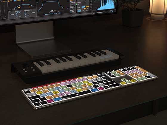
Editors Keys shortcut editing keyboards are designed to help editors and colourists work more efficiently by featuring the shortcuts for popular editing software mapped out onto the keys. This makes it easier to memorise frequently used commands and access them quickly while working on a project.
AB10 Air Wireless Backlit Editing Keyboard
The Editors Keys AB10 Air Wireless Backlit Editing Keyboard is a wireless keyboard designed for video editing and other creative workflows. It features shortcuts mapped out onto the keys, making it easier to learn and access the commands used in your editing software.
The backlit keys can be particularly useful when working in a dimly lit editing suite, allowing you to see the shortcut labels without needing to rely on a separate reference sheet.

AB10 Core Wired USB-C Backlit Editing Keyboard
The Editors Keys AB10 Core Wired USB-C Backlit Editing Keyboard provides a wired connection to your computer and features shortcuts mapped out onto the keys for popular editing software.
A wired keyboard can be useful if you prefer a direct connection to your computer or want to avoid relying on wireless connectivity while working on a project. The backlit keys also make it easier to see the shortcut labels in lower-light conditions.
Why shortcuts matter for colour grading
The Colour page in DaVinci Resolve contains a wide range of controls, from primary colour wheels to curves, scopes and tracking tools. Being able to access your most frequently used commands without navigating through menus can make the grading process more efficient.
For example, you might use shortcuts to move between clips, access the Colour page, toggle scopes or navigate your timeline. The specific shortcuts available depend on your software and keyboard configuration, but having the commands mapped out on the keys can make them easier to memorise and use consistently.
19. Editors Keys silicone shortcut keyboard covers
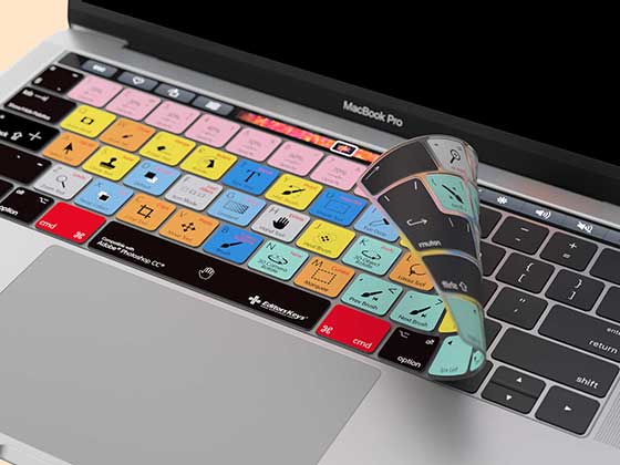
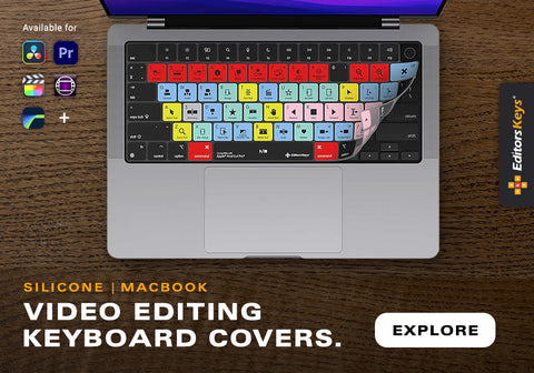
If you already have a keyboard that you enjoy using, Editors Keys silicone shortcut keyboard covers provide another way to improve your editing workflow. These covers feature shortcuts mapped out onto the keys for popular editing and music production software, helping you learn the commands while working.
The silicone covers can also help protect your keyboard from dust and light spills, and they are washable. This makes them a practical option for filmmakers who spend long hours at their editing desk.
How shortcut covers can improve your workflow
Having the shortcuts visible on your keyboard can help you memorise the commands used in your editing software. Over time, this can make it easier to access frequently used functions without needing to look up the shortcut or navigate through a menu.
For colourists, the ability to move quickly between clips and grading tools can make a noticeable difference to the overall workflow. The cover provides a visual reference while you work, allowing you to learn the shortcuts naturally through repeated use.
20. Learn from professional colourists
One of the best ways to improve your grading skills is to study the work of professional colourists and understand how they approach a project. Many colourists discuss their creative process in interviews, providing insight into the relationship between technical correction and artistic decisions.
Colourist Mitch Paulson has worked on films including Blade Runner 2049. His work on the film demonstrates the importance of collaboration between the colourist, cinematographer and director, and the value of establishing a visual direction before the final grade.
Another useful perspective comes from Stephen Nakamura of Company 3, whose work includes films such as Se7en and Panic Room. Studying the work of experienced colourists can help you develop a better understanding of how professional grades are constructed and refined.
21. Practise with your own footage
The most effective way to improve your colour grading skills is to practise regularly with footage that you have shot yourself. Working with your own material helps you understand how camera settings, lighting conditions and exposure affect the final image.
Try grading the same clip in several different styles, such as a naturalistic drama, a warm nostalgic look and a cool atmospheric look. Compare the results and consider which choices best suit the subject, lighting and story.
It is also worth practising shot matching. Take a short sequence with several different shots and try to create a consistent grade across the scene. This will help you develop an eye for exposure, white balance and colour relationships, as well as improving your ability to identify subtle inconsistencies.

Conclusion: How to colour grade like Hollywood
Learning how to colour grade like Hollywood is a combination of technical knowledge, creative judgement and consistent practice. DaVinci Resolve provides the tools needed to achieve professional-looking results, but the quality of the final grade depends on how those tools are used.
Start with accurate colour correction, establish a clear visual concept and build the grade through controlled adjustments. Use colour management, curves, colour wheels, LUTs, Power Windows and tracking to refine the image, and pay particular attention to skin tones and shot matching.
LUTs can provide a useful starting point, but manual grading gives you the flexibility to adapt the look to the footage and the story. Editors Keys colour grading LUT packs can help you experiment with different cinematic looks for compatible camera profiles, while Editors Keys shortcut editing keyboards and silicone keyboard covers can make it easier to memorise and access the shortcuts used in your editing software.
With a structured workflow and regular practice, you can develop the skills needed to create more polished, consistent and cinematic footage in DaVinci Resolve.